Image:Milk.PNG
From Wikipedia, the free encyclopedia
Size of this preview: 640 × 281 pixels
Full resolution (1,425 × 625 pixels, file size: 63 KB, MIME type: image/png)
Summary
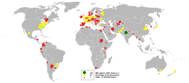
This bubble map shows the global distribution of milk output in 2005 as a percentage of the top producer (India - 91,940,000 tonnes). For example, nine yellow circles in the USA means its output is 90% of the top producer India. No circles shown does not necessarily mean no milk is produced; rather no data is available.
This map is consistent with incomplete set of data too as long as the top producer is known. It resolves the accessibility issues faced by colour-coded maps that may not be properly rendered in old computer screens.
Data was extracted on 26th June 2007 from http://faostat.fao.org/site/336/DesktopDefault.aspx?PageID=336
Based on Image:BlankMap-World.png
Licensing
 |
I, the copyright holder of this work, hereby release it into the public domain. This applies worldwide. In case this is not legally possible, |
File history
Click on a date/time to view the file as it appeared at that time.
| Date/Time | Dimensions | User | Comment | |
|---|---|---|---|---|
| current | 17:45, 13 August 2007 | 1,425×625 (63 KB) | Anwar saadat ( Talk | contribs) | (This bubble map shows the global distribution of milk output in 2005 as a percentage of the top producer (India - 91,940,000 tonnes). This map is consistent with incomplete set of data too as long as the top producer is known. It resolves the accessibili) |
See the setup instructions for more information.