Image:Inequality and mortality in metro US.jpg
From Wikipedia, the free encyclopedia
Size of this preview: 549 × 479 pixels
Full resolution (559 × 488 pixels, file size: 73 KB, MIME type: image/jpeg)
Summary
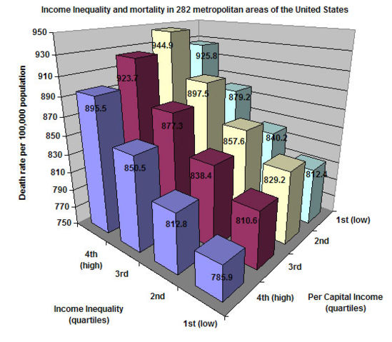
This shows death rates in metropolitan areas of the United States according to inequality of income and the average per capita income. This chart was created by myself using data from J. Lynch G.A. Kaplan, et al., "Income inequality and Mortality in Metropolitan Areas of the United States ," American Journal of Public Health 88 (1998): 1,074-80
I hereby release this image into the public domain.
Licensing
 |
I, the copyright holder of this work, hereby release it into the public domain. This applies worldwide. In case this is not legally possible, |
File history
Click on a date/time to view the file as it appeared at that time.
| Date/Time | Dimensions | User | Comment | |
|---|---|---|---|---|
| current | 20:32, 2 December 2005 | 559×488 (73 KB) | Kodemizer ( Talk | contribs) | (This shows death rates in metropolitan areas of the United States according to inequality of income and the average per capita income. This chart was created by myself using data from J. Lynch G.A. Kaplan, et al., "Income inequality and Mortality in Metro) |
See the setup instructions for more information.
File links
The following pages on Schools Wikipedia link to this image (list may be incomplete):
Categories: User-created public domain images