Image:Sachin Tendulkar graph.png
From Wikipedia, the free encyclopedia
Size of this preview: 640 × 373 pixels
Full resolution (986 × 574 pixels, file size: 7 KB, MIME type: image/png)
Summary
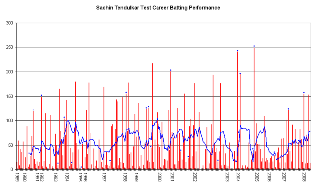
This graph details the Test Match performance of Sachin Tendulkar. It was created by Raven4x4x. The red bars indicate the player's test match innings, while the blue line shows the average of the ten most recent innings at that point. Note that this average cannot be calculated for the first nine innings. The blue dots indicate innings in which Tendulkar finished not-out.
This graph was generated with Microsoft Excel 2002, using data from Cricinfo and Howstat .
The information in this chart is current as of 2 February, 2008. <nowiki>Insert non-formatted text here[[Image:Insert non-formatted text here]][[Image:[[Image:Example.jpg]][[Image:#REDIRECT [[Example.jpg]]<br /><!-- [[Comment]]'''''Italic text''''' -->]]]]</nowiki>
Licensing
 |
I, the copyright holder of this work, hereby release it into the public domain. This applies worldwide. In case this is not legally possible, |
File history
Click on a date/time to view the file as it appeared at that time.
| Date/Time | Dimensions | User | Comment | |
|---|---|---|---|---|
| current | 07:46, 2 February 2008 | 986×574 (7 KB) | Raven4x4x ( Talk | contribs) | (This graph details the Test Match performance of Sachin Tendulkar. It was created by Raven4x4x. The red bars indicate the player's test match innings, while the blue line shows the average of the) |
See the setup instructions for more information.